The Wife Approved Release
While the main goal of this release of both the mobile app and the website is to bring feature parity between the two, it somehow ended up being the release where I lost a lot of battles in design.
Most notably, my wife has been battling with me on the color scheme I chose for indicating how great of a score a forecast represents (orange and pink for good scores, and blues for poor ones). Nearly a year of battling, and I finally conceded my "gaudy" colors that made no sense to her (and perhaps anyone but me) and now the color scheme is more monochromatic (where the brilliance of the color indicates how great the chances are). Hopefully, you all find this easier to use (though if not, I am more than happy to bring it back and reclaim victory).
![]()
Website changes
The website was lagging behind the mobile app in a different way of visualizing scores. The website used to just use color to indicate differences, but now it uses more subtle color differences but also uses a visual bar to indicate the differences in score.
Additionally, each forecast breaks down the biggest factors contributing to the forecast. These include things like cloud cover, wind, rain and more. Previously, a color bar indicated if the factor positively, negatively, or neutrally contributed to the forecast. This was not only hard to see, but difficult to determine how positively or negatively each factor contributed. So, just like the score change above, this now shows as a bar as well.
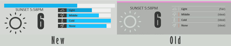
It is important to note that this bar indicates how ideal this factor is for the type of photography, not what its value actual is. For example, if the bar is nearly full and the factor is cloud cover - this indicates the cloud cover is ideal, and not that it’s mostly cloudy or overcast. Similarly, if the factor is wind and pretty much you never want it, a full bar indicates virtually no wind, whereas an empty bar would mean very windy.
Mobile App Changes
So the last release of the app was one I rushed to the store because I was excited to get new features out there. My wife did not get a chance to test or review. She reminded me of this immediately after it was approved. As such, I've made a number of usability improvements (such as you can now touch the type of forecast to change it as well as both landscape and portrait support). Additionally, the mobile app now mirrors the website's change in colors.
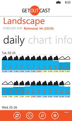
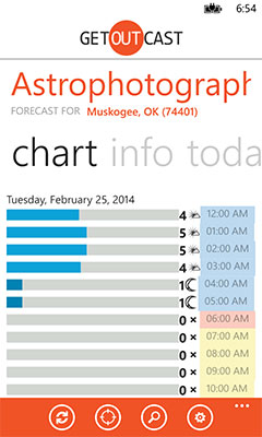
Finally, a new view was added called chart. The goal of the chart is to give you minimum amount of information (score and time) that you can make a decision as to when the conditions work best across multiple days (whereas the current setup works best in deciding across the same day).
I hope you find these changes helpful. Please let us know what you think and share GetOutCast with your friends and family.